I’m not particularly enamoured with the vSphere web client, but one thing it has encouraged me to do is get more proficient using scripting/shell utilities like PowerCLI.
When it was first released, it showed promise. But I, like many others was unimpressed by the lag and general slowness in navigation and getting things done like we were accustomed to using the old faithful c# client. There have been numerous tips & tricks to squeeze a little bit more ease of use out of it, including;
1. Adjusting the client side Flash cache; (credit to William Lam for sharing this earlier on here)
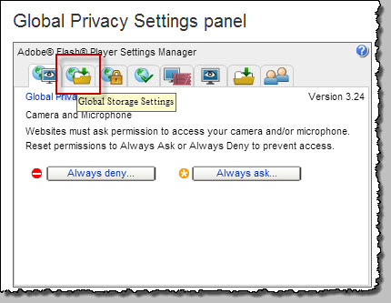
click here to load the local Flash settings panel
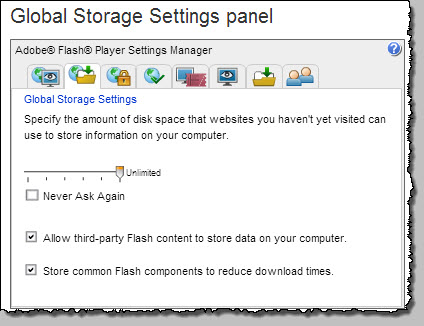
Move the slider all the way to the right to ‘unlimited’. Close the page, and restart the browser session. As the local cache warms up a bit, you should see some improvement.
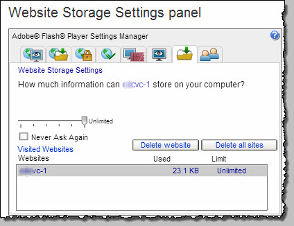
Note that this is not your VC setting but a global setting. To alter settings for your VC server only, click on the 2nd last tab (or click here), select your server name and move the slider accordingly.
2. Increase the Tomcat JVM Heap size as directed here (go the next level up from your actual scenario, or max it out, it’s only a few GB 🙂 )
3. Use Chrome !
Anyway, I was determined to make the most of it since it had been made clear that it was here to stay and that the existing client was deprecated.
So i began reading through UX Design standards document located over at the VMware Developer Center. Of particular note was the small section containing a small (but very useful) table of 9 keyboard shortcuts.
Of particular use is the ability to jump to the Inventories;
And note that these are ‘sticky’ as you move between them, you will return to the last context you were working in.
(This is not new information, it’s scattered across the vmw communities in various threads, but I think it’s good to have it all together.)
I’m hearing words that the next vSphere release will be further improved, and that the move to a full HTML5 based client is well underway. That will be cool.


